Tuesday 15 December 2009

Evaluation...


In what ways does your media project use, develop or challenge forms and conventions of real media products?

The magazine I chose to produce was highly conventional in terms of a music magazine. Having studied several previously existing magazines such as Q, NME and Rolling Stone, I found that each magazine used the same format, just with a personalised house style. I therefore thought it would be wise to adopt the same conventions for my magazine, as this was evidently the most likely approach to attracting potential readers; as well as not isolating the magazine from its competitors by making it seem less professional or less considered. The colour red is used regularly throughout the field of magazines along with yellow, as the two colours have proven to be the most eye-catching by stimulating cells in the brain. This is naturally the most effective way of drawing a reader to your magazine, so I designed my colour scheme with it in mind.
How does your media product represent particular social groups?
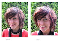
All of the images I used were of young females, and so from my previously gained knowledge of the media's representation of this social group, I edited all the image to improve the brightness, contrast and removed any blemishes. This fitted in with all of the conventions displayed in the magazines I studied, as women are shown in a highly idealised way.
What kind of media institution might distribute your media product and why?
I have mentioned previously that the media institution I would choose to publish my magazine would be the Bauer media group. This was down to the institution's long history and large knowledge base of the magazine market and music productions.
Who would be the audience for your media product and how did you attract/address your audience?
Throughout my magazine I aimed each element at a specific market, of 16-25 year old male and females. I had found through previous research that the most likely social group to buy music magazines were in this age range, as they had more money to spend on luxuries such as magazines as well as having more time to read them. By using images of artists within this age range I think that the target audience would be more likely to buy the magazine, as they could share an affinity with the artists. I also used a highly stylised and modern layout and colour scheme for the magazine to attract my target audience, as they have high expectations of magazine construction in a way older generations are unused to.
What have you learnt about technologies from the process of constructing this product, and what do you feel you have learnt in the progression from your preliminary to the full project?
The knowledge I have gained from using graphic design programmes such as Adobe Photoshop and Fireworks has increased dramatically from when I began this project. I created my preliminary task project on Microsoft Publisher, which compared to the programmes I used for the main task seems now rather primitive. The Photoshop software allows for different 'layers' on the work. This meant I could arrange things behind or in front of each other and make the whole project look much more professional than the preliminary. The colour scheme and swatches were also much more advanced, as I was able to use shadowing and place colours behind images to give them the appearance of being from a studio photo shoot. I have also expanded my knowledge of photography, learning about how to employ the rule of thirds and depth of field, along with the techniques used for editing photographs on Photoshop, such as using effects and adjusting the brightness, contrast and colour balance to improve the image. Overall, the progression I have made over the entirety of this project has been highly beneficial to the end product I have created, meaning that the magazine appears professional and highly crafted.

Monday 14 December 2009

Magazine Double Page Spread ...


For the final design of my double page spread I chose a style in-keeping with the artist presented and the language I used in the article. When I chose a setting for my image I used an existing background of purple with flowers with the artist in mind, as her name was Poppy. I also chose to have her holding a black rose as this has connotations of femininity and beauty, but the black made the look more modern. I chose a light pink font to co ordinate with the background and continue the theme of girlishness. I also used the polygonal lasso tool on Photoshop to select a flower from the background of the image, and duplicated it onto the other side of the article, making it seem more unified. I also put in a drop capital 'O' at the beginning of the article to follow the conventions of most music articles.


I think that the image I used would attract my intended target audience (of 16-25 year olds) as it is a young girl that many would be able to identify with, which is a point I made frequently throughout the article itself. The artist is wearing black, purple and cream in the image, which was intended to fit in with the colour scheme of my double page spread. I edited the image to remove blemishes and increased the contrast, which I felt followed the conventions displayed in the modern media in the portrayal of young women as free of imperfections and highly polished. I chose to stretch the image over one page and a third of the left as I felt this should be given greater emphasis, as the image of the artist is more attractive to the young reader than large blocks of text. The double page spread links back to the front page and contents page as the artist is wearing the same clothes in each and the font is all the same.

Throughout the article I wrote in a style I felt kept to the rest of my magazine; a slightly satirical tone with a genuine field of musically specific language, such as "demo", "vocals", and "electronic-based." I wrote in a tone that directly informed the audience, using first person pronouns such as in, "So I am, quite understandably I'd like to think," which gives the article an intimate, exclusive feeling. I also used a pun on the artists name with "smelling of roses" linking to the name "Poppy."
I followed magazine conventions by placing the by-line below the article stating that I wrote it and took the pictures. I also put page numbers at the bottom of the pages in-keeping with the magazine concept.

Magazine Contents Page ...


My final design for the magazine contents page followed the same colour scheme as my front page. I also used the same font and chose to list the features displayed on the cover.

I used a black background behind the heading to make it appear striking and to contrast with the white background. I had placed a grey colour overlay on the background which fitted around the images I had already placed on the page which filled up the white space meaning it appeared more professional. I also used the same masthead as the front cover, but with a different coloured font in order to enhance the magazine's unity.

I used a red, italic font in block capitals for the artist names to make them striking and to draw attention, with a smaller, black font underneath giving a brief description of the article. I felt that this followed the conventions I had found within my study of music magazines.

I added a promotion at the bottom of the page as this is a technique used in many magazines, placing it in a red box to make it more eye-catching. I also added a 'Quote of the week' feature which made the magazine seem well-established.

I chose to switch the main image to the other article from my front cover as I thought this is a style used in many music magazines to show the range of articles in the magazine. I also used different images to the front cover as I found this to be a well used concept too. I again edited the older article image to black and white with a high contrast to highlight the fact it was from another era, but edited the other image to make it brighter, which provided a better contrast between the two.

I had found that most other music magazines include the issue number of the magazine and the magazine's website, so I included both of these within my layout. I also put the page numbers associated with the images next to them, to inform the reader of the articles' content.

Magazine Front Cover ...


This is my final design for my magazine front cover. I chose to name the magazine 'Cage' as I felt this was an original name, without being too obscure to be distanced from the expectations of a music magazine. The white on red background I took directly from the music magazines I had analysed, Q and NME, as I found this to be the norm; and naturally the most effective way of drawing the attention of potential readers. I chose a bold, serif font because this gives the magazine a formal and more mature appearance, which was the look I was trying to achieve in order to attract my intended target audience of 18-25 year olds. I used the programme Fireworks to create the masthead and placed vertical lines on the letters to fit in with the title of 'Cage.'

I edited the main image on Adobe Photoshop, increasing the contrast and brightness of the subject to give it a more studio appearance. I also cut out the subject from the background so that I could design my own gradient-based background for the front cover. I did this also on Photoshop, using a grey colour scheme to eminate the conventions of the magazines I analysed, as I found they generally used a plain background to give the main image more emphasis. I also followed my colour scheme within the image, dressing the subject in co ordinating colours with bright red lipstick, which matched the masthead. I included the name of the image and a small strap line giving details of the interview inside, in order excite the readers' interest.

I used a bold serif font throughout my work as I felt this created cohesion within the whole project. I did, however, vary between italics and block capitals on certain pieces, to give the layout a professional look. I also changed between the colours of grey, white, black and dark red, which formed the basis of my colour scheme. I chose these particular colours due to my previous findings during my magazine analysis; as they proved the most popular colours to attract potential readers.

I added another smaller image at the side of the main one, detailing another feature of the magazine. I chose to keep this on a white background to keep it seperate from the other image and keep the theme of an older star by editing it to make it black and white.

I had found through my study of music magazines that they included regularly the price, bar code, website address and date; so I chose to include all of these. I also added a sell line of "cage music" as I felt this helped to promote my magazine.

I used a list at the top of the cover to make the reader interested in the bands featured in the magazine, and to provide a reason to buy it; as although not every reader could like the main star I chose to use on the front cover, they could be enticed by one of the other bands on there.

Front Cover Mock Up ...

I decided to create a mock up for my front cover, contents page and double page spread as I thought this would help me with the production of the magazine.


I chose these particular layouts as I felt they would create the most effective magazines, as well as following the conventions displayed within the genre of music magazines.

Monday 16 November 2009

Main Task Plan ...

From the poll on my blog I discovered that the majority of people that voted were most interested in the Indie/Rock genre of music. I therefore decided that my magazine would focus upon this, to successfully appeal to my audience.

In order to create this music magazine, I made a short overview of the order in which I would begin its construction;


  • Firstly I would need to create a plan for the main photographs & article.
  • Next I would begin writing the article and taking the pictures.
  • Then I could begin the construction of the magazine on Adobe Photoshop, choosing a colour scheme and choosing the layout of the front cover, contents page and main article.
  • I would then be able to put the finishing touches to the magazine.

I think that by following this plan I will be able to complete my task most effectively.

Monday 9 November 2009

Magazine Institutions ...

Before creating a magazine the potential editor must first assess the available market and chances of becoming published. I decided to conduct some research into the publishing houses in order select the more likely of groups I would attempt to sell my product to.


IPC (International Publishing Company) is based in the UK and sells 350 million copies per year. Whilst the fact the company serves the UK market is a definate advantage, they already publish 'NME' magazine, which is based upon the rock/indie genre I wish to explore in my publication, and could be unlikely to buy into a rival or similar magazine.


Bauer Media Group are a well-established company based in Hamburg. They publish, however, in fifteen countries and currently own Q, Mojo and Kerrang magazines. Although all of these magazines are music-based and may have been potential rivals for my magazine, they all focus upon differing genres. I think that the wealth of experience Bauer has as a publisher could only be to my advantage.


I would, therefore, attempt to sell my magazine Bauer Media Group as I think that they have a long history of music magazine publications and would be able to sell my magazine successfully.

Double Page Spread Research ...

As the main task involved constructing a double page spread feature of a music magazine, I researched an existing magazine article in order to glean the main features, conventions and language used.


The article I looked at was from 'Mojo' magazine, featuring the band The Faces. The graphology of the piece is based upon a balance of image and text. The article is ranged across the left side of the feature with a right-orientated image, spanning the whole right page and half of the left. The main photograph is of the band's most notorious members, Ronnie Wood, Ronnie Lane and Rod Stewart. What is noticeable is the lack of caption denoting their names; which suggests their renowned status and also the expectation of the magazine in regards to the audience, in that they must know The Faces members. The band is presented in typical 70's rocker attire along with the mullet haircut, immediately indicating the time period. There is also a smaller minor image in the form of an old-fashioned photograph, creating a scrapbook feel to the article; as this is focusing upon the band's past successes.


The font used shows a block sans serif for the title and lead paragraph - recalling past show titles and show business. The main article text is different; smaller and serif. The by-line follows the leading paragraph directly, seeming to be part of the article itself. There is also a caption at the top of the main image detailing the context of the shot ("Backstage, Early 70's") and with an open quotation underneath from Tom Wright, the band photographer.


The band itself was notorious for their old school 70's rock and roll attitude; sex, drugs and plenty of groupies. Consisting of legends; Rod Stewart, Ronnie Wood, Ronnie Lane, Ian McLagan and Kenney Jones; the band enjoyed success with four albums before splitting in 1975. The article is therefore a reflection of their past, rather than a promotion of new material. It is likely then that the intended audience is preexisting fans rather than people looking to listen to some new artists, as they are no longer recording.


The text begins with a direct quote from the focus of the magazine, photographer Tom Wright. The 'voice' of the article is his memories of touring with the band and forms an informal, conversational tone. The journalistic tone comes from the creator of the text, Ross Bennett, forming a narration behind Wright's quotes, or filling in the gaps.


The text is littered with language requiring a shared understanding, "rythm'n'boogie boys", "The Jeff Beck Group", "The Who", "Gasoline Alley", and "boozy 4/4 blues and country-soul" all require a knowledge of music terms and bands; they are not explained, the writer seems to take it for granted that anyone bothering to read the article must understand what they are talking about.


There are also an excessive use of hyperbolic phrases, "satin-panted excesses of superstardom" and "uproarious bonhomie and killer performances" both suggest the importance and success of the band themselves, and perhaps the admiration of the author. The use of emotive and descriptive adjectives such as "scuzzy", "lavish" and "exclusively", help to create an idealised congratulatory feel of the band's success.

Thursday 22 October 2009

Preliminary Contents Page ...


I created a mock-up of a school magazine contents page as an example of what my final piece would look like. This was the first design I came up with, with only the basic outline of the layout and amount of images I would have put on my contents page.


I also created an example of the kind of text and colour scheme I would use on my contents page. I chose to use the same colours and WordArt from my front cover as I felt this would give the magazine a better sense of cohesion and fit in with the theme of 'Autumn'. I chose a sans serif font because this was bolder and helped identify the writing as the main point of focus on the page.

Thursday 8 October 2009

Completed Front Cover ...


This is the final design for my school magazine front cover. I elaborated on my original idea for the masthead, selecting a section of the main image and placing it behind the title of 'DHM'. I also changed the position of the main heading of the singer's name to below the masthead and centered it, as I thought this placed more focus on the image and improved the graphology of the front cover. I also added red boxes around the masthead, logos and puff as I felt this gave them more emphasis.


I also edited the school badge logo on my front cover to make it unique and fit in with the colour scheme I adopted for the front cover. I used Adobe Photoshop to edit the colour and also added a lighting effect.


I next changed the specialist science college logo by inverting the colours on Photoshop, as this made the logo more striking and in keeping with the appearance of the rest of the front cover.


I decided to stick to a theme on my front cover and named it the 'Autumn Edition'. Using this as a basis for the rest of my design I used a background in my photograph of greenery and dressed the subject in red and black, which followed the colour scheme of dark red and black that I had planned for the front cover. I also decided upon using bold heading of WordArt on Publisher rather than just standard font, as this made the headings stand out from the image. I also edited the image itself, in order to follow the conventions displayed in teen magazine front covers. The subject is female and is portrayed as highly polished, so I edited the image thus;

I used Photoshop to change the lighting of the image, making the subject appear in a brighter contrast. I also edited the colours of the image in make it more striking, the subject's hair was made redder and their skin brighter, in-keeping with the conventions of magazine front covers. I also cropped the image slightly in order to adhere to the medium close-up rule of head and shoulders in the shot. I used the green leaves in the background of the shot to follow my theme of autumn, along with dressing the subject in black and red clothing in order to keep to my colour scheme.

Wednesday 30 September 2009

Contents Page Research ...

After researching and analysing several front covers of teen magazines, I then investigated the contents pages in order to ascertain their key features and conventions.


This is an example of a music magazine contents page, but it allowed me to explore it's conventions nonetheless.


The images are shown in a line along the right-hand side of the page with the contents list of pages beside. There is a heading at the top of the page introducing the magazine.


When constructing the contents page for my school magazine I hope to employ some of the conventions shown here, but with perhaps certain differences.

Front Cover Mock Ups ...


After determining the style and target audience of my school magazine, I began my initial designs for the front cover.

This is the first basic mock up of the front cover that I created Microsoft Publisher. It show the masthead in the top left corner which I felt followed the conventions of the magazines I analysed along with the medium close up photograph with puffs around the edges. I thought that this would make an effective layout for my school magazine as it was not too crowded with information, creating a more visually pleasing cover as well as not over-loading the potential reader with what they can discover inside.


This is the next mock up of my front cover that I made without my original images, in order to ascertain the colour scheme I wished to use and develop the layout. I kept most of the original layout in as I felt this worked effectively and had little to change. This also allowed me to begin to develop my masthead logo and decide on the fonts I wished to use.


Q Magazine Front Cover Analysis ...

I next looked at Q magazine and their Kings Of Leon front cover. The masthead is a bold, eye-catching white on red "Q" which suggests the magazine's identity as a foreward thinking piece.


The photography used on Q's front covers follows a trend of accentuating the artists' image - whether this may be of the female sexuality or typical male 'toughness'. This photograph shows no variation from the convention, focusing not on making the band look attractive but upon showcasing their stereotypical male identity; assuming fighting poses behind a sheet of breaking glass. This links to the heading "Breakthrough". The heading itself opposes the ideology of the male identity however, with the pink on white colour scheme, perhaps suggesting the band's attitude towards societal expectations and conventions.


Cohen's moral panic ideology is evident in the front cover of this magazine, portraying obvious violence and the band are sporting injuries. The text used is a bold font for the main headings with a serif font used for the quote.

Tuesday 29 September 2009

Preliminary Task ...

Before beginning the preliminary task of producing a school magazine front cover and a mock-up contents page, I first began a little research to determine my target audience and the style of magazine I wished to produce.

Upon my initial research, I discovered that in Deyes High School itself there was plenty of school information targeted at parents, a monthly newsletter, but little to nothing that provided specifically selected news and interest for the actual students. It would therefore seem pru
dent for any magazine to capitalise on this hole in the school market, with a magazine aimed at the student population.

This then led me to further research
into the type of magazine aimed at young people and the conventions displayed therein. As you can see below, the magazines I looked at that are directed at the teen market feature several similarities;


Firstly, all three magazines feature a medium close-up photograph of the featured celebrity, with puffs arranged around the periphery, not covering the face of the subject. The masthead is placed at the top of the cover, with the subject's picture placed directly below. It is also rare to find a front cover picture of a male celebrity, so it would seem the female star entices more readers.

In order to reach my target audience successfuly then, I determined to follow each of these conventions in my own school magazine aimed at teenagers aged from 11 to 18.


Thursday 24 September 2009

Rolling Stone Front Cover Analysis ...

I felt before beginning the task of producing a front cover, contents page and main feature of a magazine I should first research into the subject. I first gathered a selection of different magazine front covers and analysed their content.


The first magazine I looked at was Rolling Stone. The front covers of this magazine are typically highly stylised with a well considered colour scheme and balance of graphology. The masthead is obscured by the singer which suggests her importance and status over the magazine itself, as well as providing an easy recognition for the potential reader.


The photograph is revealing, which supports Laura Mulvey's idea of the male gaze by showcasing the female sexuality. Both her hair and make up are extreme but clothing is minimal, which provides balance to the photograph. The graphology itself is suggestive of a female presence – the pink background, bubbles, and white writing presenting the stereotypical ‘girlishness.’


The cover puffs are arranged a in long row at the side of picture, with a smaller font showing their lesser importance compared to the other main articles.


The font used is white with a black outline, making the text stand out from the pink background. The capitalised font used for the main articles provide a title for the main articles and display their importance over the smaller article titles.