Thursday 22 October 2009

Preliminary Contents Page ...


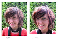
I created a mock-up of a school magazine contents page as an example of what my final piece would look like. This was the first design I came up with, with only the basic outline of the layout and amount of images I would have put on my contents page.


I also created an example of the kind of text and colour scheme I would use on my contents page. I chose to use the same colours and WordArt from my front cover as I felt this would give the magazine a better sense of cohesion and fit in with the theme of 'Autumn'. I chose a sans serif font because this was bolder and helped identify the writing as the main point of focus on the page.

Thursday 8 October 2009

Completed Front Cover ...


This is the final design for my school magazine front cover. I elaborated on my original idea for the masthead, selecting a section of the main image and placing it behind the title of 'DHM'. I also changed the position of the main heading of the singer's name to below the masthead and centered it, as I thought this placed more focus on the image and improved the graphology of the front cover. I also added red boxes around the masthead, logos and puff as I felt this gave them more emphasis.


I also edited the school badge logo on my front cover to make it unique and fit in with the colour scheme I adopted for the front cover. I used Adobe Photoshop to edit the colour and also added a lighting effect.


I next changed the specialist science college logo by inverting the colours on Photoshop, as this made the logo more striking and in keeping with the appearance of the rest of the front cover.


I decided to stick to a theme on my front cover and named it the 'Autumn Edition'. Using this as a basis for the rest of my design I used a background in my photograph of greenery and dressed the subject in red and black, which followed the colour scheme of dark red and black that I had planned for the front cover. I also decided upon using bold heading of WordArt on Publisher rather than just standard font, as this made the headings stand out from the image. I also edited the image itself, in order to follow the conventions displayed in teen magazine front covers. The subject is female and is portrayed as highly polished, so I edited the image thus;

I used Photoshop to change the lighting of the image, making the subject appear in a brighter contrast. I also edited the colours of the image in make it more striking, the subject's hair was made redder and their skin brighter, in-keeping with the conventions of magazine front covers. I also cropped the image slightly in order to adhere to the medium close-up rule of head and shoulders in the shot. I used the green leaves in the background of the shot to follow my theme of autumn, along with dressing the subject in black and red clothing in order to keep to my colour scheme.