Monday, 16 November 2009

Main Task Plan ...

From the poll on my blog I discovered that the majority of people that voted were most interested in the Indie/Rock genre of music. I therefore decided that my magazine would focus upon this, to successfully appeal to my audience.

In order to create this music magazine, I made a short overview of the order in which I would begin its construction;


  • Firstly I would need to create a plan for the main photographs & article.
  • Next I would begin writing the article and taking the pictures.
  • Then I could begin the construction of the magazine on Adobe Photoshop, choosing a colour scheme and choosing the layout of the front cover, contents page and main article.
  • I would then be able to put the finishing touches to the magazine.

I think that by following this plan I will be able to complete my task most effectively.

Monday, 9 November 2009

Magazine Institutions ...

Before creating a magazine the potential editor must first assess the available market and chances of becoming published. I decided to conduct some research into the publishing houses in order select the more likely of groups I would attempt to sell my product to.


IPC (International Publishing Company) is based in the UK and sells 350 million copies per year. Whilst the fact the company serves the UK market is a definate advantage, they already publish 'NME' magazine, which is based upon the rock/indie genre I wish to explore in my publication, and could be unlikely to buy into a rival or similar magazine.


Bauer Media Group are a well-established company based in Hamburg. They publish, however, in fifteen countries and currently own Q, Mojo and Kerrang magazines. Although all of these magazines are music-based and may have been potential rivals for my magazine, they all focus upon differing genres. I think that the wealth of experience Bauer has as a publisher could only be to my advantage.


I would, therefore, attempt to sell my magazine Bauer Media Group as I think that they have a long history of music magazine publications and would be able to sell my magazine successfully.

Double Page Spread Research ...

As the main task involved constructing a double page spread feature of a music magazine, I researched an existing magazine article in order to glean the main features, conventions and language used.


The article I looked at was from 'Mojo' magazine, featuring the band The Faces. The graphology of the piece is based upon a balance of image and text. The article is ranged across the left side of the feature with a right-orientated image, spanning the whole right page and half of the left. The main photograph is of the band's most notorious members, Ronnie Wood, Ronnie Lane and Rod Stewart. What is noticeable is the lack of caption denoting their names; which suggests their renowned status and also the expectation of the magazine in regards to the audience, in that they must know The Faces members. The band is presented in typical 70's rocker attire along with the mullet haircut, immediately indicating the time period. There is also a smaller minor image in the form of an old-fashioned photograph, creating a scrapbook feel to the article; as this is focusing upon the band's past successes.


The font used shows a block sans serif for the title and lead paragraph - recalling past show titles and show business. The main article text is different; smaller and serif. The by-line follows the leading paragraph directly, seeming to be part of the article itself. There is also a caption at the top of the main image detailing the context of the shot ("Backstage, Early 70's") and with an open quotation underneath from Tom Wright, the band photographer.


The band itself was notorious for their old school 70's rock and roll attitude; sex, drugs and plenty of groupies. Consisting of legends; Rod Stewart, Ronnie Wood, Ronnie Lane, Ian McLagan and Kenney Jones; the band enjoyed success with four albums before splitting in 1975. The article is therefore a reflection of their past, rather than a promotion of new material. It is likely then that the intended audience is preexisting fans rather than people looking to listen to some new artists, as they are no longer recording.


The text begins with a direct quote from the focus of the magazine, photographer Tom Wright. The 'voice' of the article is his memories of touring with the band and forms an informal, conversational tone. The journalistic tone comes from the creator of the text, Ross Bennett, forming a narration behind Wright's quotes, or filling in the gaps.


The text is littered with language requiring a shared understanding, "rythm'n'boogie boys", "The Jeff Beck Group", "The Who", "Gasoline Alley", and "boozy 4/4 blues and country-soul" all require a knowledge of music terms and bands; they are not explained, the writer seems to take it for granted that anyone bothering to read the article must understand what they are talking about.


There are also an excessive use of hyperbolic phrases, "satin-panted excesses of superstardom" and "uproarious bonhomie and killer performances" both suggest the importance and success of the band themselves, and perhaps the admiration of the author. The use of emotive and descriptive adjectives such as "scuzzy", "lavish" and "exclusively", help to create an idealised congratulatory feel of the band's success.

Thursday, 22 October 2009

Preliminary Contents Page ...


I created a mock-up of a school magazine contents page as an example of what my final piece would look like. This was the first design I came up with, with only the basic outline of the layout and amount of images I would have put on my contents page.


I also created an example of the kind of text and colour scheme I would use on my contents page. I chose to use the same colours and WordArt from my front cover as I felt this would give the magazine a better sense of cohesion and fit in with the theme of 'Autumn'. I chose a sans serif font because this was bolder and helped identify the writing as the main point of focus on the page.

Thursday, 8 October 2009

Completed Front Cover ...


This is the final design for my school magazine front cover. I elaborated on my original idea for the masthead, selecting a section of the main image and placing it behind the title of 'DHM'. I also changed the position of the main heading of the singer's name to below the masthead and centered it, as I thought this placed more focus on the image and improved the graphology of the front cover. I also added red boxes around the masthead, logos and puff as I felt this gave them more emphasis.


I also edited the school badge logo on my front cover to make it unique and fit in with the colour scheme I adopted for the front cover. I used Adobe Photoshop to edit the colour and also added a lighting effect.


I next changed the specialist science college logo by inverting the colours on Photoshop, as this made the logo more striking and in keeping with the appearance of the rest of the front cover.


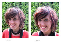
I decided to stick to a theme on my front cover and named it the 'Autumn Edition'. Using this as a basis for the rest of my design I used a background in my photograph of greenery and dressed the subject in red and black, which followed the colour scheme of dark red and black that I had planned for the front cover. I also decided upon using bold heading of WordArt on Publisher rather than just standard font, as this made the headings stand out from the image. I also edited the image itself, in order to follow the conventions displayed in teen magazine front covers. The subject is female and is portrayed as highly polished, so I edited the image thus;

I used Photoshop to change the lighting of the image, making the subject appear in a brighter contrast. I also edited the colours of the image in make it more striking, the subject's hair was made redder and their skin brighter, in-keeping with the conventions of magazine front covers. I also cropped the image slightly in order to adhere to the medium close-up rule of head and shoulders in the shot. I used the green leaves in the background of the shot to follow my theme of autumn, along with dressing the subject in black and red clothing in order to keep to my colour scheme.

Wednesday, 30 September 2009

Contents Page Research ...

After researching and analysing several front covers of teen magazines, I then investigated the contents pages in order to ascertain their key features and conventions.


This is an example of a music magazine contents page, but it allowed me to explore it's conventions nonetheless.


The images are shown in a line along the right-hand side of the page with the contents list of pages beside. There is a heading at the top of the page introducing the magazine.


When constructing the contents page for my school magazine I hope to employ some of the conventions shown here, but with perhaps certain differences.

Front Cover Mock Ups ...


After determining the style and target audience of my school magazine, I began my initial designs for the front cover.

This is the first basic mock up of the front cover that I created Microsoft Publisher. It show the masthead in the top left corner which I felt followed the conventions of the magazines I analysed along with the medium close up photograph with puffs around the edges. I thought that this would make an effective layout for my school magazine as it was not too crowded with information, creating a more visually pleasing cover as well as not over-loading the potential reader with what they can discover inside.


This is the next mock up of my front cover that I made without my original images, in order to ascertain the colour scheme I wished to use and develop the layout. I kept most of the original layout in as I felt this worked effectively and had little to change. This also allowed me to begin to develop my masthead logo and decide on the fonts I wished to use.